Nove-Noga Info Post
Nove-Noga: My Nove-Noga Header with GIMP
Part 1
If you found this page useful,Please Like and Share. Thank you.
Nove-Noga!

 My Nove-Noga Header with GIMP Part 1.
This PR was a direct response to a Press Release by Dennis Thorgesen of Lisech eMarketing on 11/28/2012. Brand Image Tips by Dennis Thorgesen.
Thank You, Dennis. His PR was a detailed evaluation of my website http://nove-noga.com/ with many valuable suggestions to solve some of my problems. Creating a header merely step one. It took a couple of efforts to get it right. Dennis wrote in a private note to me, "Your "brand" is Nove-Noga. You should have a logo on the website. You have a real nice one somewhere because we have seen it."
*Note: This was originally written some time ago. During the most recent revision of the Nove-Noga Site, use of this header was discontinued. I have created a sample image as it appeared on the site. Click Here to See Previous Nove-Noga Header.*

Simulation of Header in Use at Nove-Noga.
*Note: The Center Content was Active on the Nove-Noga Site.
For the left side:
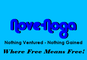
Nove-Noga
Nothing Ventured - Nothing Gained
Tools, Information & Opportunity
For the right side:
My Picture 110x110
Curtiss Martin
Nove-Noga
This Instructional PR will detail the Assembly of the Left and Right side headers. Each element will be centered over a 320 pixel Panel in the main body of the Nove-Noga website. When the completed header is exported to JPEG, I will add it to the Image file and place a reference in the CSS file for the header section of the page.
GIMP is an amazing program with capabilities far beyond my current usage. I was intimidated the first twenty times I took a look at it. Perhaps if I had experience with other paint programs, I would not have these problems. Trust me when I say that it took far longer to write these instructions than it took to do the project. My advice is just to Dive-In using these instructions to guide your early use. Note the usage of "#)" to indicate each set of Click-by-Click instructions.
Notation Methods:
Each instruction line is usually in two parts; Verbal then Symbols.
"#)" The Symbol line will begin with "#)".
EG: #) >>File->Open("Name" = 'work image')[Open/Enter]
For more info on notation and standard practices see: "GIMP Notation and Descriptions"
*-*-*-*-*-*
1) Fire up the Free* GIMP (GNU Image Manipulation Program). See bottom of my home page at http://nove-noga.com/ for the link to download your own copy.
*Free Means FREE!
#) >>GIMP
2) Open a new project 1280x200 Pixels at the standard 72ppi.
#) >>File->New{Create a New Image} Width(1280) Height(200) [OK]
3) On the left side of my screen is a Dockable Dialogue {Toolbox - Tool Options}. At the top of this panel is a group of tools. First we want to set our foreground and background colors. Set foreground color by clicking on the upper of the two tiles (One above the other) just below the tools. The {Change Foreground Color} Dialogue box will appear with a lot of options. You can choose your color by clicking on the pallet areas, enter the code in HTML notation or choose from previously used colors displayed as tiles. I will continue to use the colors that I have chosen for my site. Click [OK] once your selection is made.
#) >>{Toolbox}[Foreground]{Change Foreground Color} HTMLnotation(0000ff)[OK]
4) Then click the lower tile to set the background color. Repeat as above. To fill the background, choose the Bucket Fill Tool. (A paint can icon to the right of the text icon "A") The {Tool Options} dialogue will now be titled "Bucket Fill". Under Fill Type choose the radio button "BG color fill". Now click on your background area and see the color applied. *NB: GIMP has an amazing set of options available. Have Fun.*
#) >>{Toolbox}[Background]{Change Background Color}HTMLnotation(00bfff)[OK]
#) >>{Toolbox}[Bucket Fill Tool] {Tool Options}[o] BG color fill{Untitled-1.0}
*-*-*
Create the Left side elements.
For the left side:
Font="Alba Matter" Size=50 Color=0000ff ("Nove-Noga")
Font="Century Gothic Bold" Size=15 Color=000000 ("Nothing Ventured - Nothing Gained")
Font="Bodoni MT Heavy Italic" Size=15 Color=0000ff ("Tools, Information & Opportunity")
*-*-*
5) Set up Text Tool for "Nove-Noga"; Font=Alba Matter Size 50px.
In {Toolbox Tool-Options} dialog select [Text Tool] ('the "A" Icon').
#) >>{Toolbox Tool-Options}[Text Tool]
In {Tool Options} dialog Click the Font Button and choose Font.
#) >>{Tool Options} [Aa]-> "Alba Matter"
In {Tool Options} dialog Set Size to 50 px
#) >>{Tool Options} Size = 50 px
In {Tool Options} dialog set Justify to Center
#) >>{Tool Options} Justify = [Centered]
6) Select a point near the middle of your {Untitled} work area and enter the text "Nove-Noga". Do not worry much about placement yet.
#) >>{Untitled}("Nove-Noga")
7) Click another point in your work area. Otherwise the next changes will be applied to your current text.
#) >>{Untitled}
8) Set up Text Tool for "Tools, Information & Opportunity"; Font="Bodoni MT Heavy Italic" Size=15.
In {Tool Options} dialog Click the Font Button and choose Font.
#) >>{Tool Options} [Aa]-> "Bodoni MT Heavy Italic"
In {Tool Options} dialog Set Size to 15 px
#) >>{Tool Options} Size = 15 px
9) Select the {Untitled} dialog box by its header or by clicking another place in the work area and enter the text "Tools, Information & Opportunity".
#) {Untitled}("Tools, Information & Opportunity")
10) Click another point in your work area to change text again.
#) >>{Untitled}
11) Set up Text Tool for "Nothing Ventured - Nothing Gained"; Font="Century Gothic Bold" Color=000000.
In {Tool Options} dialog Click the Font Button and choose Font.
#) >>{Tool Options} [Aa]-> "Century Gothic Bold"
In {Tool Options} dialog Set Color to 000000
#) >>{Tool Options} ['colored panel] {Text Color} HTMLnotation=(000000) [OK]
12) Select the {Untitled} dialog box by its header or by clicking another place in the work area and enter the text "Tools, Information & Opportunity".
#) {Untitled}("Nothing Ventured - Nothing Gained")
*-*-*
Note that we started with the selected Foreground color as the Text Color. The changes to {Tool Options} were only as needed. Check your spelling. To make changes look to {Layers-Gradients} and Right-Click the desired layer. Choose Text Tool from the popup menu and make your adjustments.
*-*-*
13) Select the Alignment Tool from {Toolbox} and Drag a box over your first element and Align the element with the Center of the work area.
#) {Toolbox}[Alignment Tool]
#) Drag a box over target element.
#) {Tool Options}[Align Center of Target]
14) Select the Move Tool from {Toolbox}; in {Layers-Gradients} select the layer for the next element in your sequence. On the {Untitled} work area Shift-Click-Hold (you can release the shift key after you have grabbed the element) and move it into approximate desired vertical position.
#) {Toolbox}[Move Tool]
#) {Layers-Gradients}['next element']
#) ^>{Untitled}['next element']; Drag into desired position. Repeat as necessary.
#) Repeat 13) for this element.
15) Repeat Step 14 for third element.
*-*-*
Review and repeat steps as necessary until you are pleased by the results. GIMP has some excellent tools for Undoing your steps however, I suggest that you save each major step in case you change your mind later. Then you can restart your sequence from the appropriate point.
*-*-*
16) Save your {Untitled} as the first of the sequence in a new folder. For my purposes I will Save "HeaderA1.xcf in MyDocuments/GIMP/Header. As this is not my first project, I will only need to create the header folder. The default save for a new image is in "My Documents".
#) >>File->SaveAs {Save Image}("HeaderA1.xcf")->>("Name"= "GIMP")->[Create Folder] ("Header")[Enter][Save/Enter]
*-*-*
The next step is to merge the elements for the left side and set it in the approximate desired position.
*-*-*
17) Merge top 3 Layers. In {Layers-Gradients} Right-Click the first layer and Select "Merge Down" from the Popup menu. Repeat to complete the consolidation of the Left Side Elements.
#) Rt>{Layers-Gradients}Top Layer ->Merge Down
#) Rt>{Layers-Gradients}Top Layer ->Merge Down
18) Select the Alignment Tool from {Toolbox} and Drag a box over your merged element.
#) {Toolbox}[Alignment Tool]
#) Drag a box over target element.
#) {Tool Options}[Align Middle of Target]
*-*-*
I observed that the Top of my selected area is considerably above the visible text. Using the mouse and pointer while viewing the mouse position indicator at the bottom of {HeaderA1.xcf}, I estimate that the difference is 16 pixels. Splitting the distance I will set the Offset in {Tool Options} to 8 and Click [Distribute Vertical centers of targets]. Oops, this needs to be a negative number. Nove-Noga!
*-*-*
19) In {Tool Options} Set Offset=-8 and Distribute Vertical Centers of targets.
#) {Tool Options} Offset=-8
#) >>{Tool Options} [Distribute vertical centers of targets]
*-*-*
By observation (see above), I note that my element is 268 Pixels wide. According to the dimensions set in my CSS file, my side panels are 318 Pixels wide to which we add 2 pixels for the Edges. To center this above the side panel I will need an offset of 26 pixels.
*-*-*
20) In {Tool Options} Set Offset=26 and Distribute Left Edges of targets.
#) {Tool Options} Offset=26
#) >>{Tool Options} [Distribute left edges of targets]
21) Save {HeaderA1.xcf} as {HeaderA2.xcf}
#) >>File->SaveAs{Save Image}("HeaderA2.xcf") [Save/Enter]
*NB: A good trick when saving sequential names: In {Save Image} hit ['right arrow'] key to go to Right edge of name; Hit [Backspace] key to remove last Digit; Key-in the next digit; Hit [Enter/Save]*
With the added detail in this Instructional PR, I had to split it into 2 parts.
See "Nove-Noga: My Nove-Noga Header with GIMP Part 2" for the rest of the project.

Simulation of Header in Use at Nove-Noga.
*Note: The heading and 468x60 Banner displayed on the original header are simulated in this presentation.*
The Header described here is good for use on Desktop Websites. However, as more people have gone mobile, so has the Internet. The header used in this InfoPost consists of three parts and is capable of adjusting for the screen size. The GIMP Tutorial on this is coming soon. Nove-Noga!
 For more information on GIMP
and a working list of my GIMP Tutorials,
go to:
http://nove-noga.com/GIMP.html
Time is your most precious commodity.
Do as much with your time as you can.
Nothing Ventured - Nothing Gained.
Nove-Noga!


